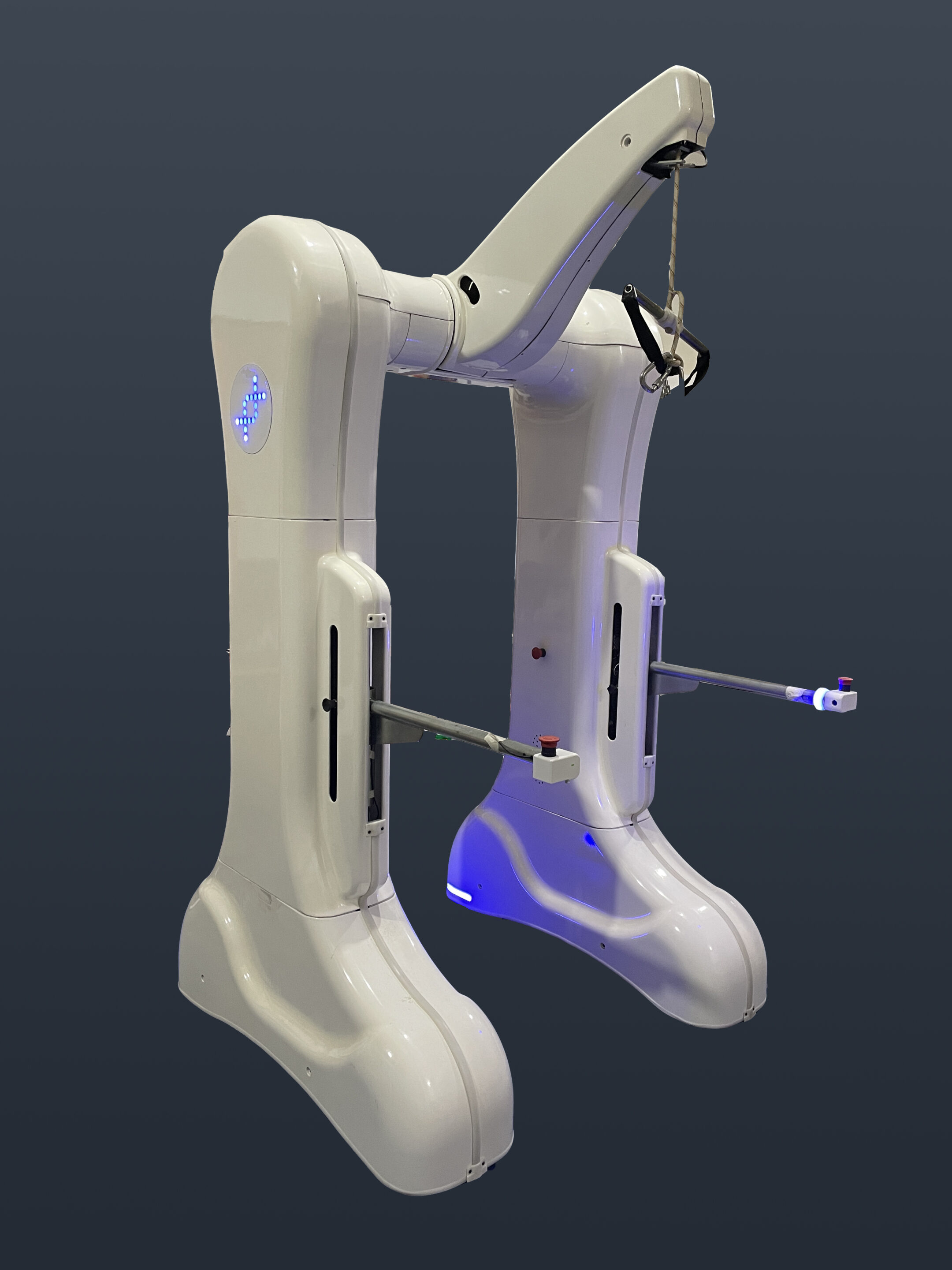
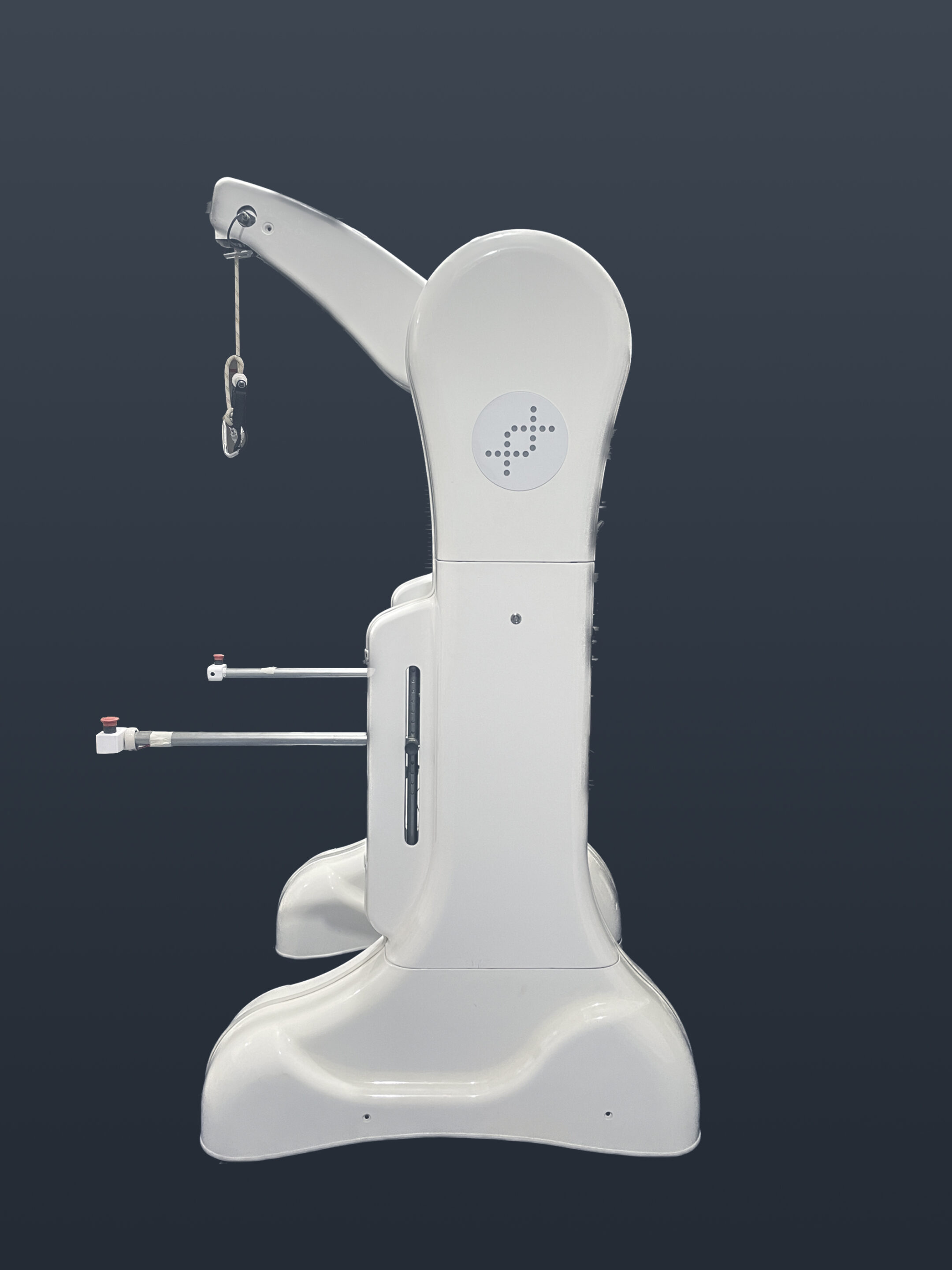
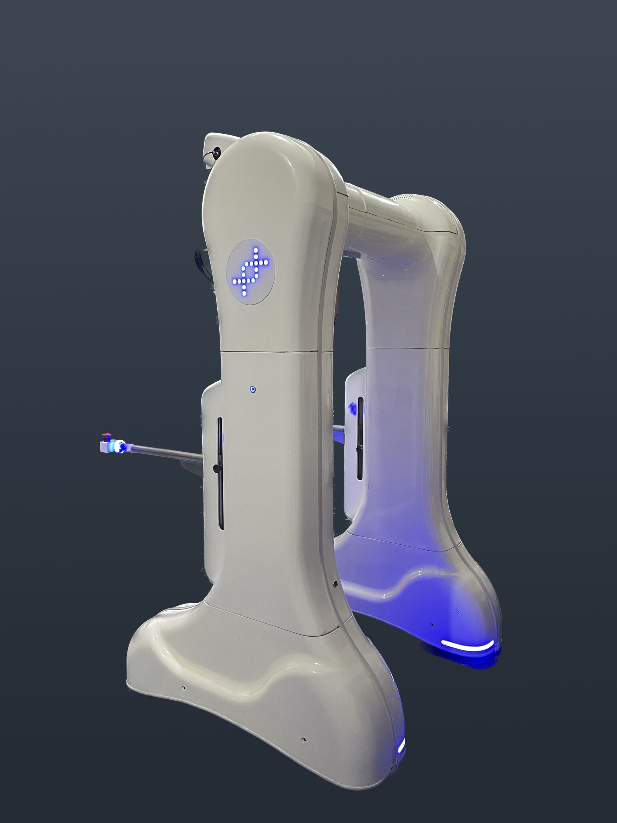
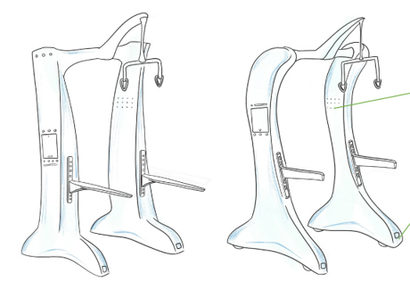
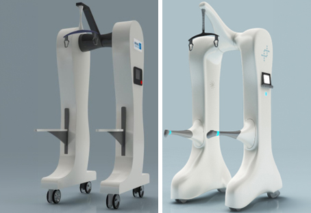
Structural limitations and multiple design options were explored during the design process.
Key Engineering Solutions
Solutions
Timetooth started by identifying specific areas of improvements by analyzing feedback from customers including patients, doctors and physiotherapists. Timetooth also carried out market research on aspects like user centric design, colour scheme and texture, accessibility, audio and visual cues etc.
Industrial designers were engaged to develop concept sketches. Further structural limitations and multiple design options were explored during the design process. Design iterations like hidden wheels, a docking point for the tablet and redesigning of the handlebar was done to enhance safety and ease of operations.
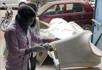
Simultaneously alternative manufacturing processes were considered. Once design was finalized, design detailing was initiated, considering the FRP manufacturing process. Modifications were made in the concept design as per the structural interfacing. In addition, manufacturability and assembly aspects were considered.
Manufacturing was done under close supervision by aligning different vendors to execute various steps.
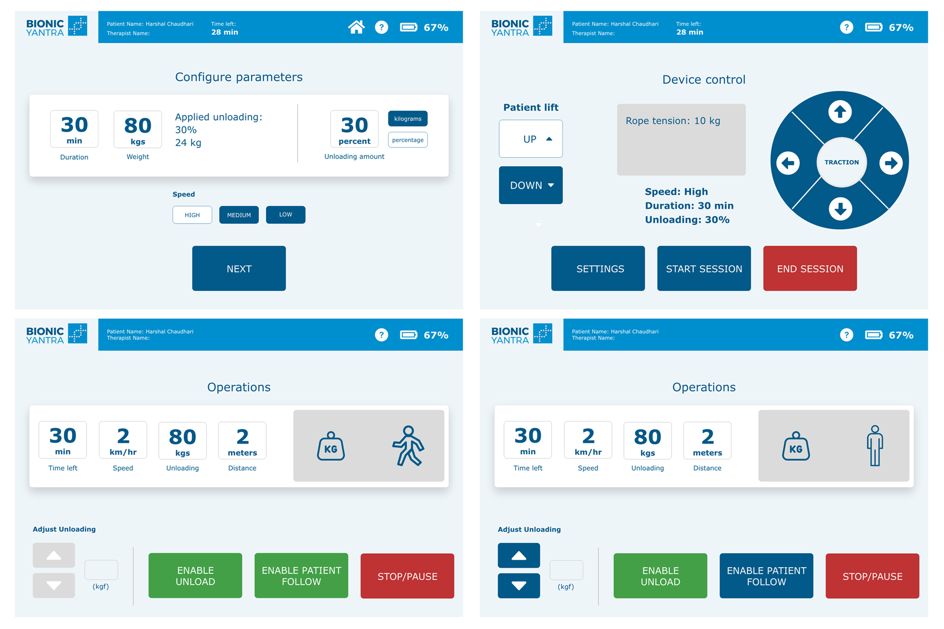
The UI interface was simplified to reduce the need for user training. A survey was conducted to improve the interface design, layout and language. The flow of steps of operation and selection of words was done in a way that was self explanatory. A draft design was shared with users to get feedback and fine tuning was done in the UI design.
